My Portfolio / Content Design Examples
UX Writing and Information Experience (IX) Outputs
Content Design Examples
Good UX needs good content. Over the past decade, I've crafted impactful written content with concern for the entire user journey, ensuring a cohesive and consistent information experience (IX) across touchpoints. This work involves creating and reviewing UI copy, designing information architecture, creating diagrams to explain abstract processes, and developing style guides, all with accessibility, usability, and localisation in mind.
Informed by UX methodologies, usability principles, and behavioural psychology, this portfolio page showcases a range of output related specifically to written copy, individual elements, and layout for digital content. From contextual help to microcopy, each example demonstrates my ability to collaborate with cross-functional teams, apply user-centred content design principles, and create content that aligns with brand voice, all with the aim to improve the overall user experience.
UX writing for roadmap templates
Background. Roadmaps is an offering that allows its users to visually represent product development plans. The Product team responsible for this offering created roadmap templates to help get users started based on their use case.
Action. I worked asynchronously with the designer on the in-product text to communicate what the options were.
Outcome. Aside from fixing smaller issues like typos and changing the content from British to American English, I rewrote the content to be more clear and direct. I removed repetition, ambiguous phrases, and phrases that might not translate well. In line with UX writing best practices and company guidelines, I also front-loaded CTAs with a verb and replaced title case with sentence case.

Copy for settings
Background. While updating the documentation for product settings, I found inconsistently written and hard to understand copy in the UI. Many settings were written by the engineers that added them, without thought for the end user or style guidelines.
Action. I spoke with customer-facing colleagues and engineers to understand what each of these settings did and to seek feedback on alternative copy and groupings.
Outcome. I created new, informative copy to make the settings readable, consistent in phrasing, grammatically correct, and in line with UX writing guidelines. I also grouped the settings into logical categories and crafted in-line copy to provide short descriptions that linked out to the documentation, which I also updated.
Researcher landing page
Background. I designed and conducted interviews with card-sorting exercises with Principal Investigators (PI) at the University of Cambridge to inform the design of a landing page for the university's Research Office website.
Action. I mocked up a researcher landing page that showed how information could be presented based on PI mental models and research processes.
Outcome. The mockup included copy that focused on key research project management activities, in line with how PIs defined them. Following content design principles, headings started with a user action and were written to be definitive and concise. Based on user needs uncovered in the interviews, lists of relevant sources of support were also added to the bottom of the mockup.


Content review of fraud management UI
Background. A user interface (UI) was developed by engineers to help Fraud Analysts visually manage and investigate failing operations. It used machine and engineer-centric language and didn't match the flow of user actions.
Action. To understand the problems that were being solved by the UI, I talked with colleagues to create four user scenarios and then reviewed the UI.
Outcome. I wrote a report that presented my review of the visual layout, structure, elements, and labelling of the UI in relation to the four user scenarios. The final section of the report recommended a new content structure and labelling system.
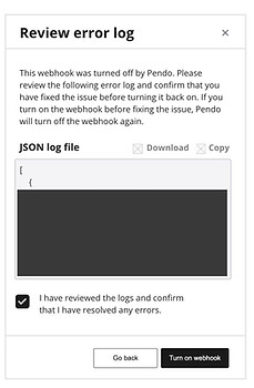
Messages for webhook failures
Background. We needed to communicate that webhooks had been automatically and intentionally turned off for a reason that needed to be resolved by the user. This was to prevent serious service disruptions caused by high error rates.
Action. I reviewed and revised three UI message designs that were created to appear at different points in the user flow.
Outcome. I commented on the Figma designs and then created wireframes for quick iteration and review of suggested layout and content. My suggestions were intended to make the messages informative, actionable, and clear.


